The age pyramid describes the age distribution within countries and it is called a pyramid because it closely resembles the shape. There are different stages within the age pyramid as explained on Wikipedia http://en.wikipedia.org/wiki/Population_pyramid.
While all countries’ population pyramids differ, four general types have been identified by the fertility and mortality rates of a country.
Stable pyramid
A population pyramid showing an unchanging pattern of fertility and mortality.
Stationary pyramid
A population pyramid typical of countries with low fertility and low mortality, very similar to a constrictive pyramid.
Expansive pyramid
A population pyramid showing a broad base, indicating a high proportion of children, a rapid rate of population growth, and a low proportion of older people. This wide base indicates a large number of children. A steady upwards narrowing shows that more people die at each higher age band. This type of pyramid indicates a population in which there is a high birth rate, a high death rate and a short life expectancy. This is the typical pattern for less economically developed countries, due to little access to and incentive to use birth control, negative environmental factors (for example, lack of clean water) and poor access to health care.
Constrictive pyramid
A population pyramid showing lower numbers or percentages of younger people. The country will have a greying population which means that people are generally older, as the country has long life expectancy, a low death rate, but also a low birth rate. This pyramid has been occurring more frequently, especially when immigrants are factored out, and is often a typical pattern for a very developed country, a high over-all education and easy access and incentive to use birth control, good health care and few or no negative environmental factors.
 Overall 3rd world countries show the first two sages and developed countries show the last two stages.
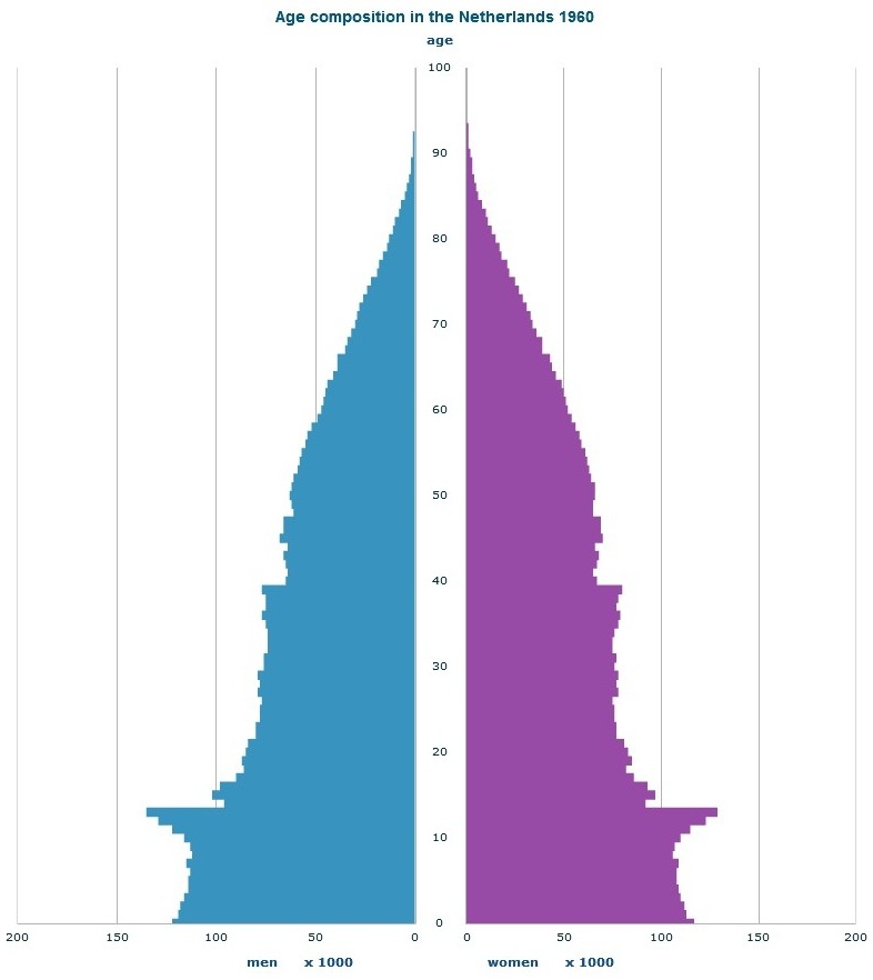
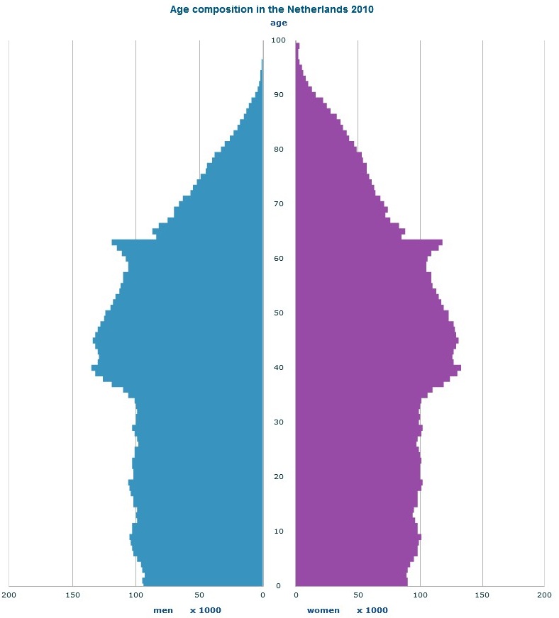
This development of pyramid shape can be perfectly observed in the population distribution history of the Netherlands.
Stage 2: Age pyramid of the Netherlands in the year 1960
Source: Central Bureau of Statistics (CBS)
 Stage 4: Age pyramid of the Netherland in the year 2010
Source: Central Bureau of Statistics (CBS)
 For more information on the age Pyramid of the Netherlands look to:
http://www.cbs.nl/en-GB/menu/themas/bevolking/cijfers/extra/piramide-fx.htm
